Brand Identity
Doula Branding
A warm, grounded identity for a doula practice — built around presence, breath, and trust.
- Year
- 2024
- Featured work
- 03
Role
Brand identity & art direction
Deliverables
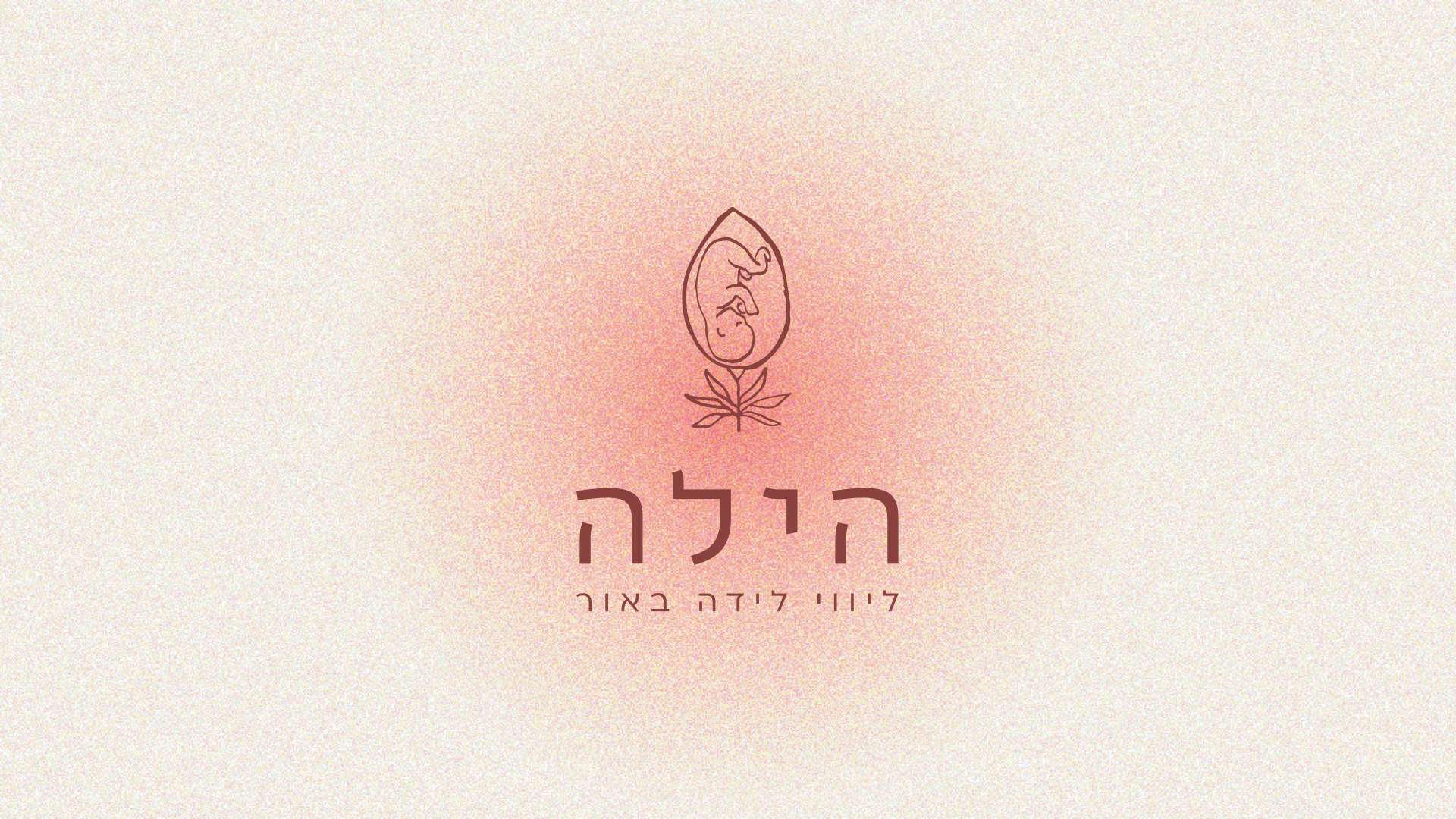
- Logo & wordmark system
- Color, typography & visual language
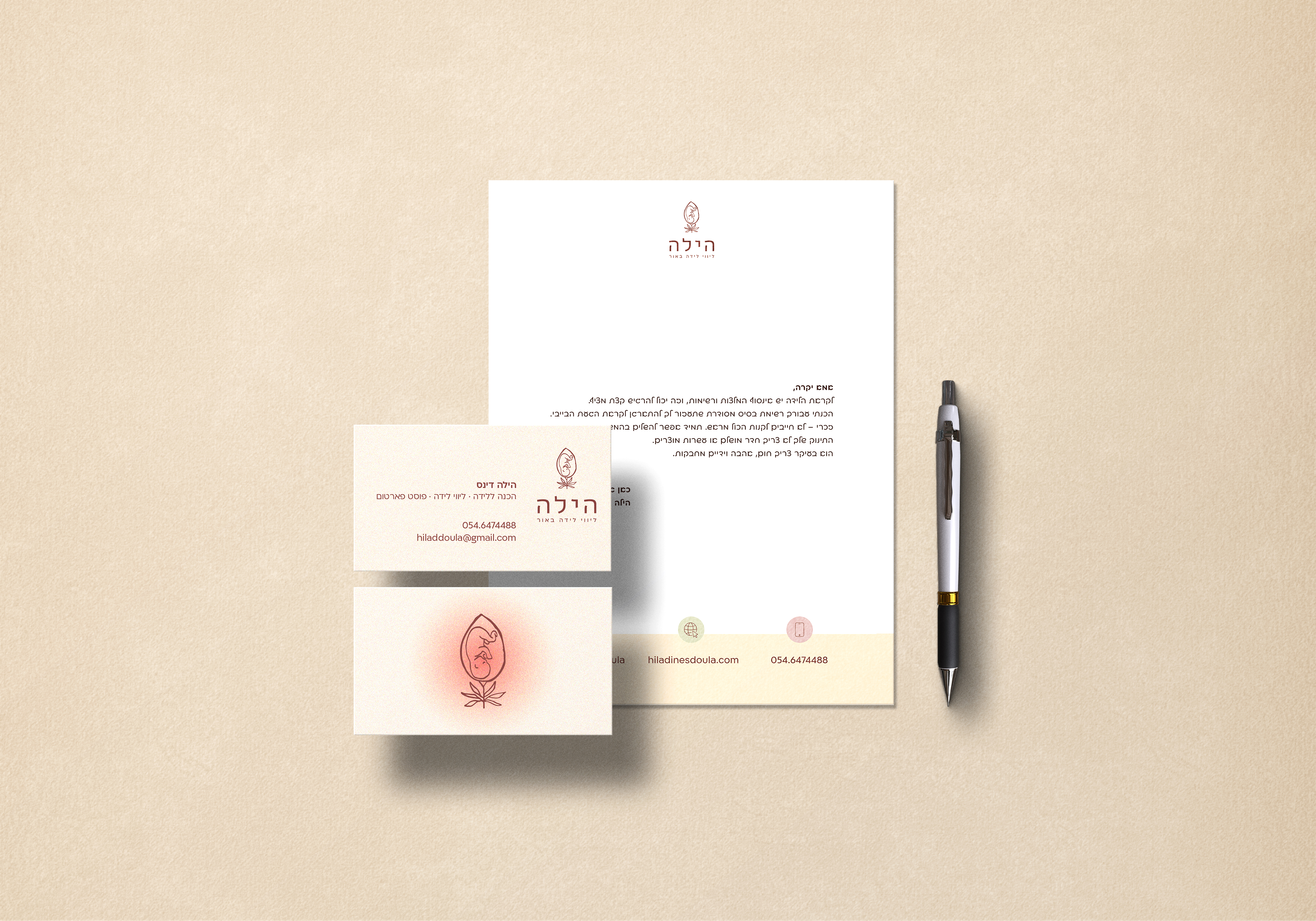
- Stationery & print applications
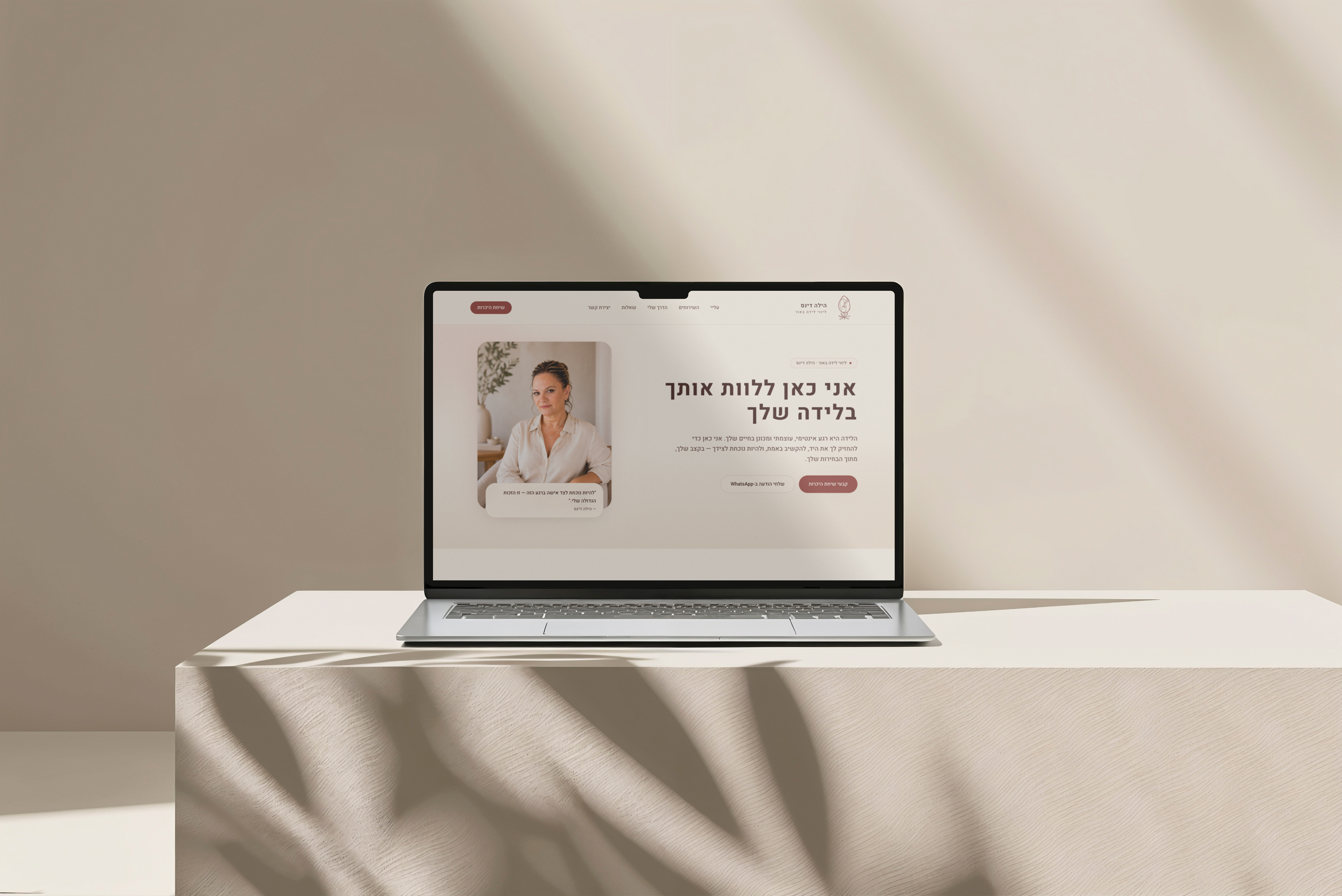
- Website design direction
A doula practice needed an identity that felt steady and human — not clinical, not overly soft. The work began with language: how trust is built before the first meeting ever happens.
The visual system uses warm neutrals, generous spacing and typographic calm. Stationery, social templates and a simple web direction extend the same breath through every touchpoint.